StudioPatina
Emerald Street, New Orleans CURTIS & DAVIS Mid Century Modern

Image above - page from Architectural Record, 1955, showing the house three years after construction.

The overall objective of this analysis was to discover the original paint color schemes of various finishes on portions of the exterior windows and trim. Other elements were sampled to provide further insight into the overall paint campaign at the date of original construction. The period of significance is the original date that the house was constructed - 1952. Image above was just before renovation, 2013.
The analysis discovered the original, extant first layers of paint colors and provided a basic understanding of the color direction of the buildings’ architects, Nathaniel C. Curtis, Jr., and Arthur Q. Davis.


The mid-century modern colors, like the architectural styles of the same era, responded to a post WWII mind set embracing new directions without fuss.
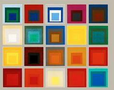
Generally, the colors were imported conceptually from the Bauhaus along with the architectural basis for the stylistic expressions at this time; the palette reflects much of what Annie and Josef Albers chose in their designs. Their color theory “function with art” was based originally on the reduced primary palette from the de Stijl movement in Holland in the 1920’s.
The exterior post and door trim are displayed next to Compilation, Homage to the Square, by Josef Albers, 1950. Joseph Albers (and his fiber arts wife Annie) explored color on color using simple square shapes (Image from: http://thedelightsofseeing.blogspot.com/2010/11/series.html (accessed Nov. 22, 2014).


The image above left is a page from the Glidden color brochure, 1950, and shows nearly identical colors to the choices that Curtis and Davis made for the house when compared to the exterior door trim chromacronology (above right) which contains all the colors applied to the house since it was constructed.
At this mid-century point of color development in the US, colors were clean and medium in depth. The primaries - red, yellow, blue - figured prominently, balanced by a neutral like a tan found on the window trim and exterior hall ceiling (middle layer). Black was rarely used as a neutral; whites were clean and straightforward like the rest of the palette.
The relationship between Alber's color study, the Glidden color card, and the chromacronology is the best I have seen.